Happy
Identity & corporate website
Agency:
Happy
The Ask
As part of the Happy team, we set out to refine the brand identity to better reflect our mission: making technology feel joyful, human, and emotionally engaging. The strategy emphasized a friendly, approachable design language. Even the name “Happy” carried a double meaning, embedding “app” to underscore our focus on creative, uplifting tools.
Branding Toolkit
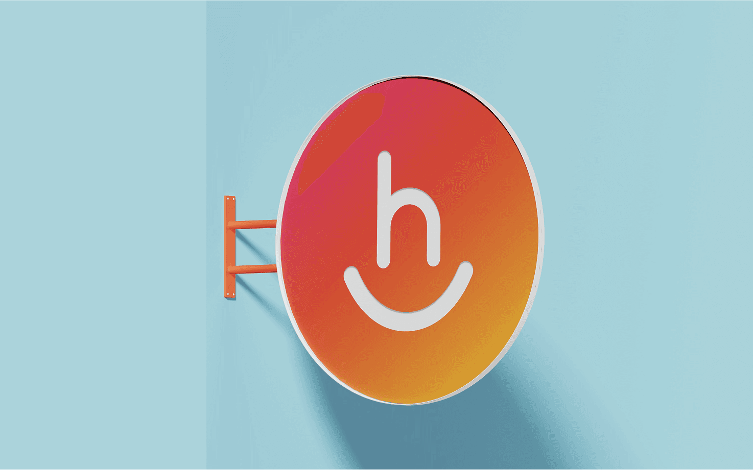
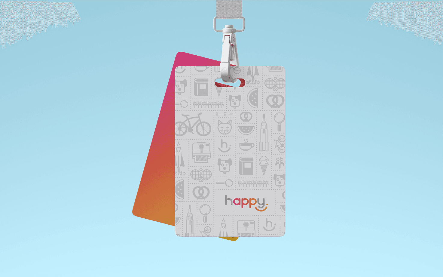
While the logo was already developed by the team's creative director, it became the foundation for the entire visual identity. Its playful, welcoming design set the tone for every brand element that followed, serving as the core inspiration for extending the system across digital and marketing touchpoints.

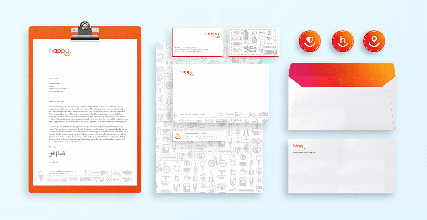
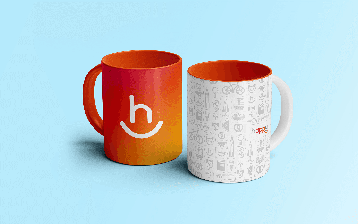
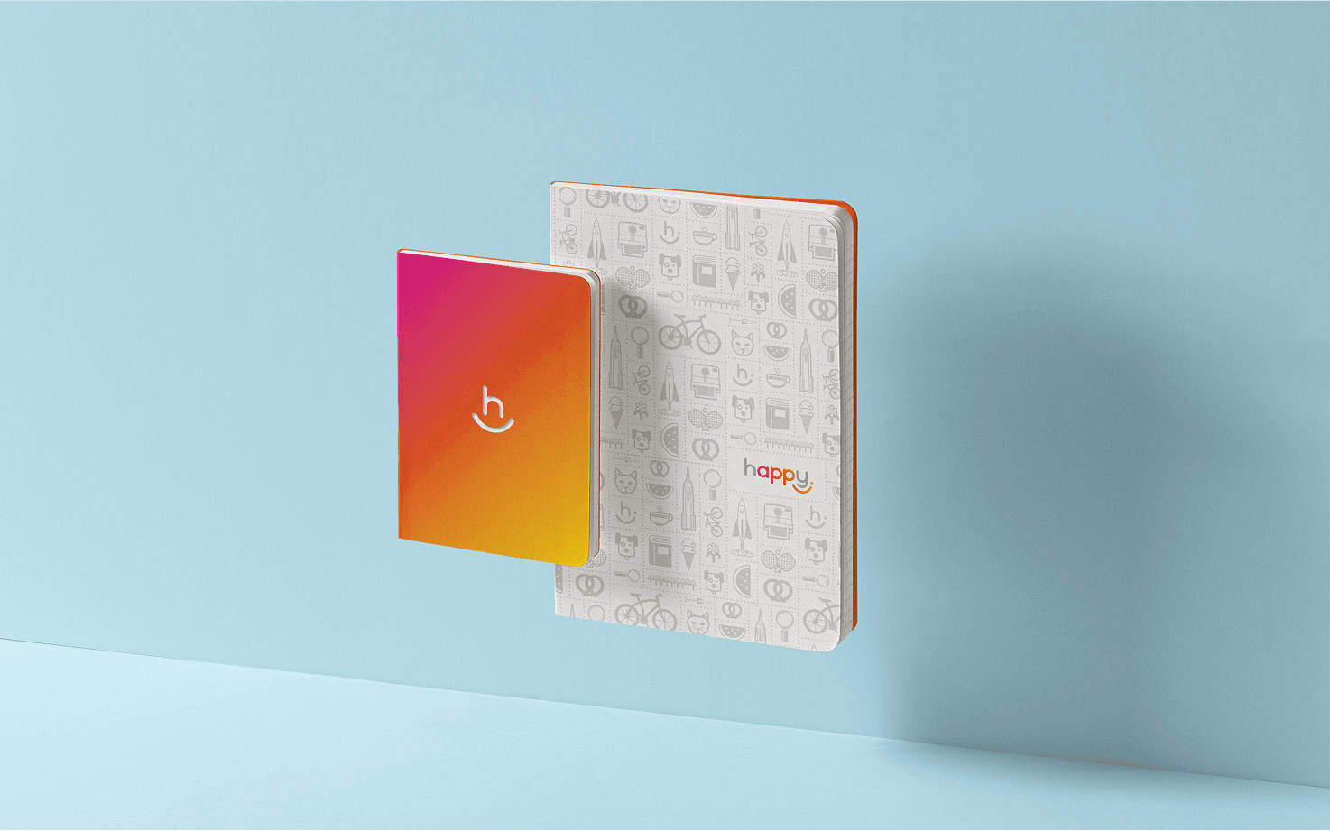
We built a flexible color system around three gradients and a solid. The Hibiscus–Sunflower gradient served as the primary palette, with solids pulled from it as needed. A Sky–Pinkberry gradient offered soft pastel options, while greys provided neutral support. The Happy solid orange was used as the main accent when limited to solids.
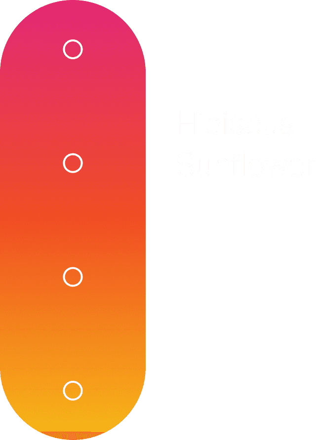
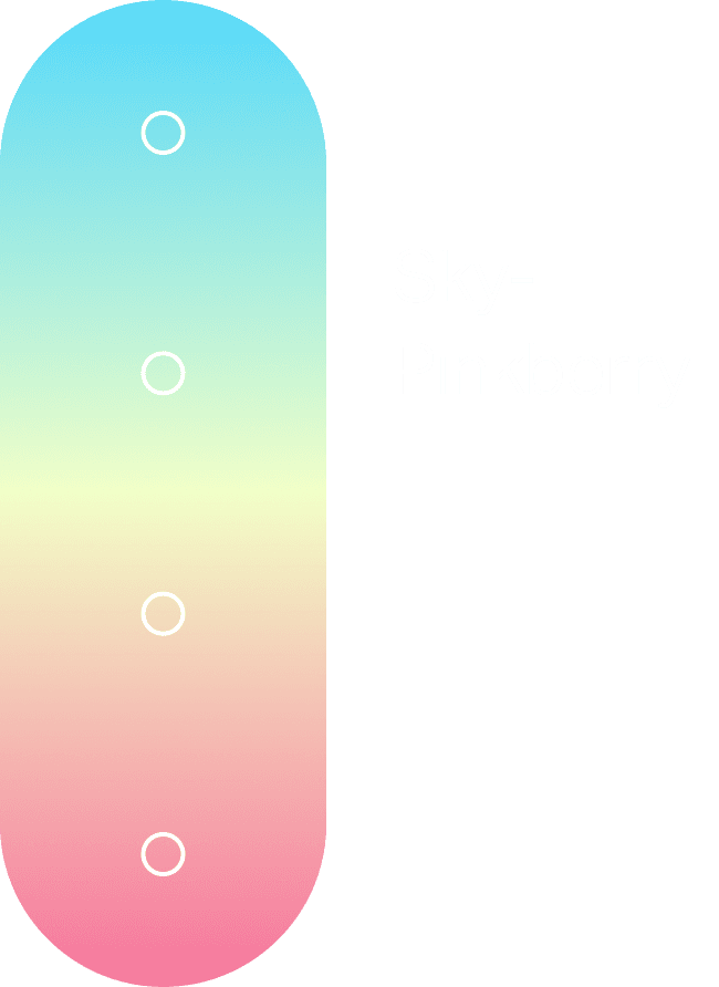
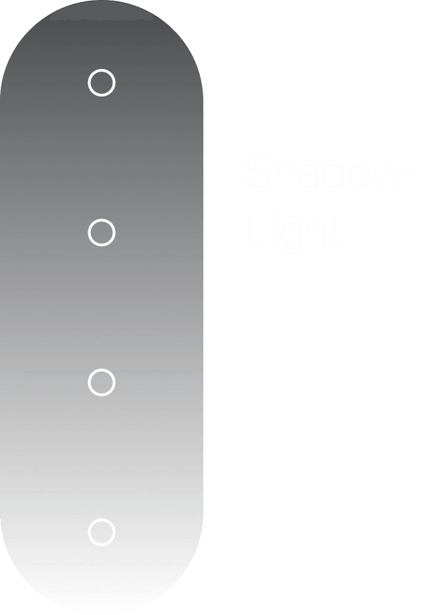
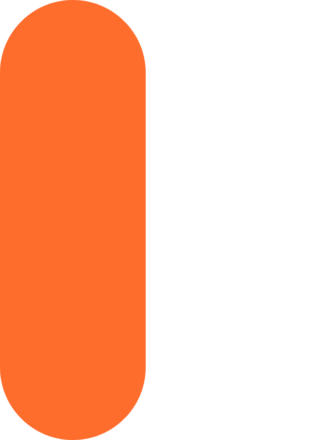
We built a flexible color system around three gradients and a solid. The Hibiscus–Sunflower gradient served as the primary palette, with solids pulled from it as needed. A Sky–Pinkberry gradient offered soft pastel options, while greys provided neutral support. The Happy solid orange was used as the main accent when limited to solids.
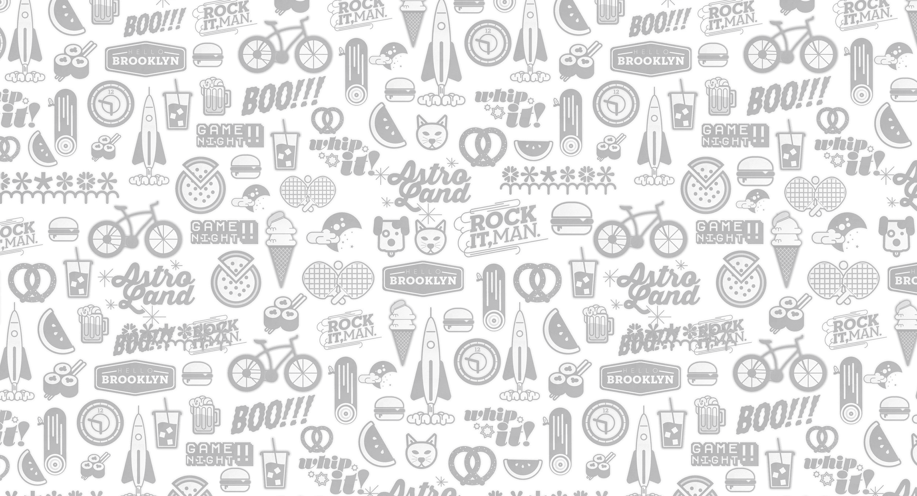
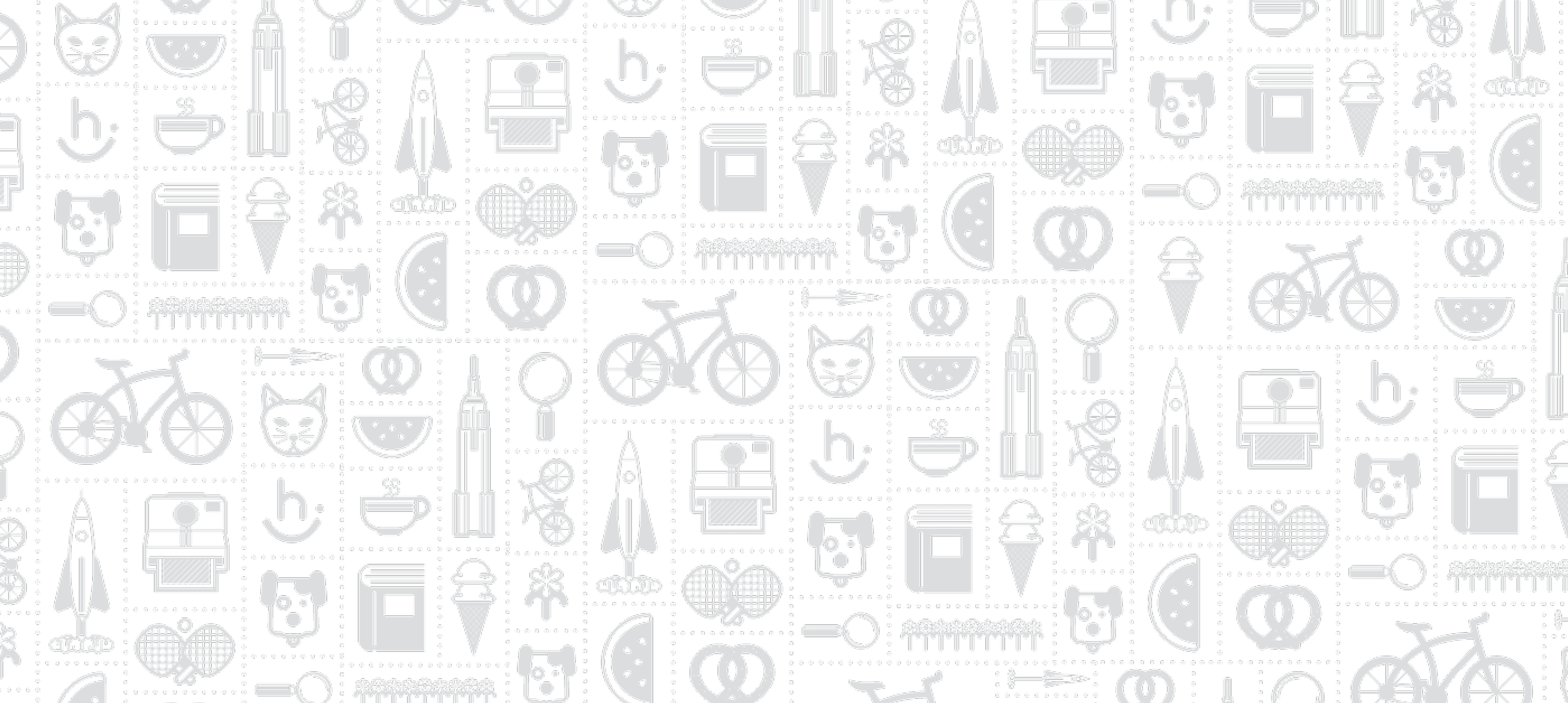
The Curio Cabinet illustration system was created to support the brand’s playful, approachable tone. Using bold lines and simple forms, the icons were designed for versatility, scaling seamlessly across digital, print, and environmental applications while maintaining clarity and energy.
The combination of the color system, dynamic gradients, Curio Cabinet illustrations, and approachable typography formed a cohesive brand that radiated positivity and creativity. Every element was carefully crafted to feel bright, friendly, and energetic, reinforcing the idea that technology could be both joyful and emotionally engaging at every touchpoint.
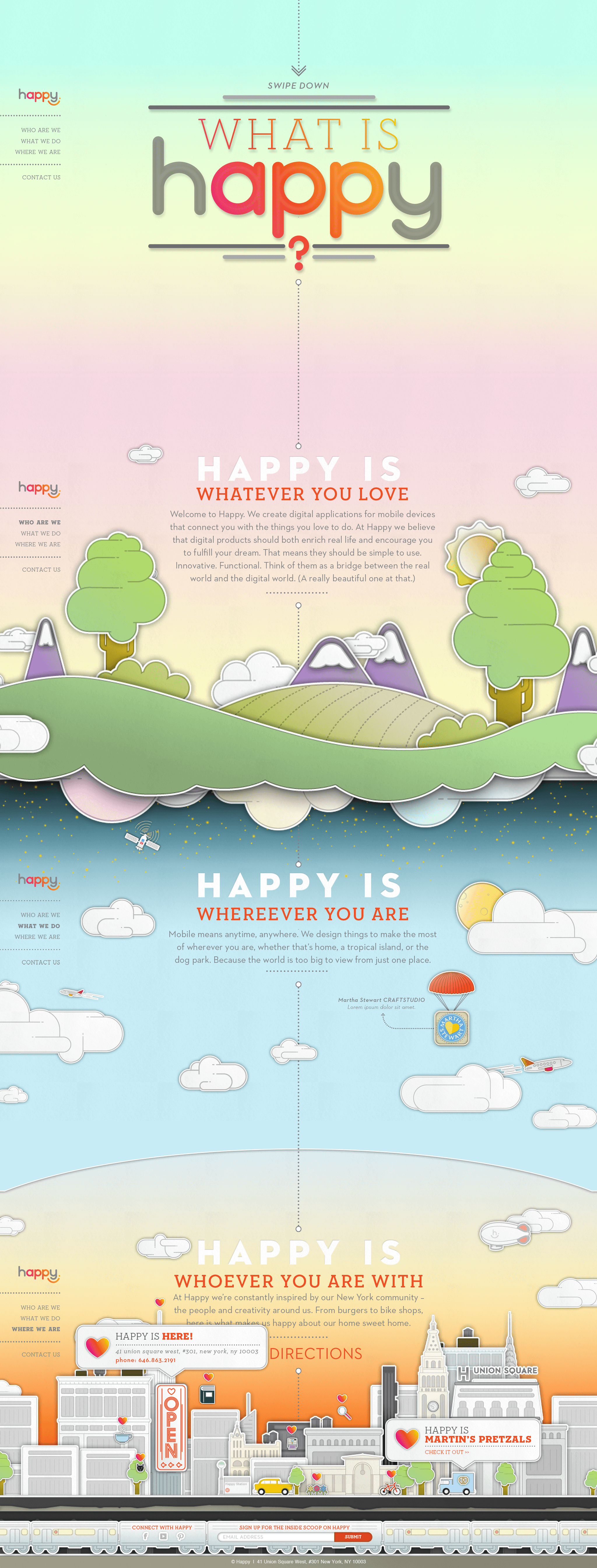
Website
The flagship piece of the Happy identity was the website—a rich, parallax long-scroll experience filled with playful visual treats and animations. Designed to bring the brand’s spirit to life, the site served as an engaging platform to tell Happy’s story in a dynamic, memorable way.